Want to skip ahead and get a Mongo analytics solution launched? Check out our MongoDB Analytics page where you can start a Knowi trial. You can also set up a 15-minute call with a member of our team to see if Knowi may be a good BI solution for your project.
Table of Contents
- Introduction
- Creating Your First Visualization
- Data blending NoSQL and SQL data with Joins
- Advanced Features
- Summary
Introduction
In this post, we’ll give a hands-on, end-to-end tutorial on using Knowi to connect to data in MongoDB Atlas and build visualizations from it in minutes, demonstrate how you can blend data on the fly from SQL and NoSQL data sources, and explore its other advanced features like Natural Language Processing (NLP) and Integrated Machine Learning.
Creating Your First Visualization
In this tutorial, we’ll use the Knowi UI to connect to our pre-configured MongoDB Atlas database in the cloud to visualize and analyze data from it.
Sign up for a free Knowi account here and let’s get started!
Connecting to MongoDB Atlas
Once you’ve logged in to Knowi, we’ll start by connecting to our MongoDB Atlas data source. Knowi also natively integrates to over 30 different types of data sources including NoSQL, relational, data warehouses, flat files, and REST-API’s.
The following connection steps assume you will be connecting to Knowi’s demo MongoDB Atlas datasource. If connecting to your own Atlas datasource, make sure to whitelist Knowi’s IP addresses in Atlas, and enter your connection string and Atlas credentials in the appropriate fields pictured below.
Steps:
- From the Playground dashboard, select “Datasources” on the left-hand side panel then click ‘New Datasource’
- Select MongoDB Atlas from the list of datasources. Pre-configured settings are available to access the Knowi demo MongoDB Atlas database
- Once in the ‘New Datasource’ page, start by giving your datasource a name. The rest of the fields are pre-filled for this demo Atlas database
- Click ‘Test Connection’ to confirm successful connection to the MongoDB Atlas database
- Hit ‘Save’
Writing Your First Query
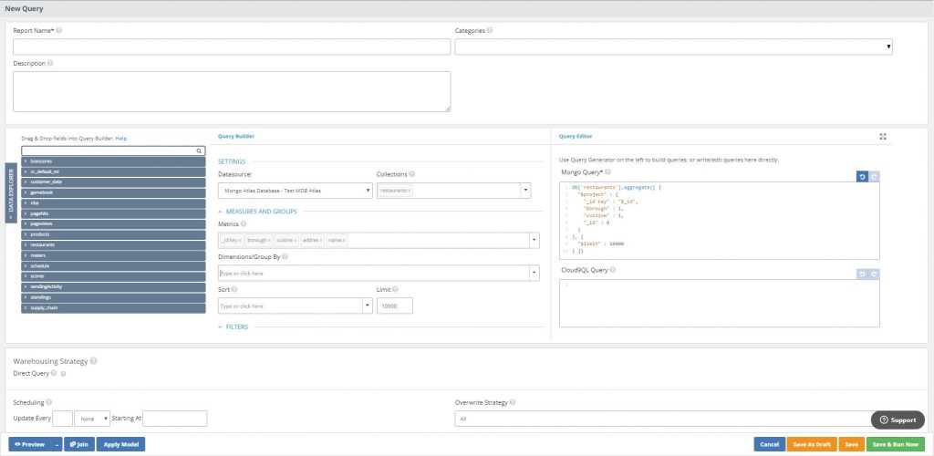
After you’ve connected to MongoDB Atlas, it will automatically pull a list of collections along with field samples (or column names for relational databases). This gives you the option to auto-generate queries using the UI, or write them directly into the query box. In this example, we’ll select the restaurants collection and choose the fields we want to analyze with the Query Builder.
Steps:
- Open the Query Generator by clicking ‘Start Querying’
- In the ‘Collections’ drop down menu, choose the restaurants collection.
- You can expand The ‘Data Explorer’ panel on the left to see all the collections and the fields inside them
- In the ‘Metrics’ dropdown, select the _id key, borough, cuisine, address, and name fields
- Notice on the right-hand side that a native MongoDB query was being auto-generated
- If you already knew the query you needed, you could’ve pasted or written it directly
- Click ‘Preview’ to to instantly preview the results
- After previewing the results, give your query a name then hit ‘Save & Run Now’

Creating Your First Visualization
Now that you’ve written your query, it’s time to create your first visualization. In the following steps, we’ll create a new dashboard and drag the query/report you just created into the dashboard. We’ll then select the fields we want to visualize and create a stacked column chart. The goal is to visualize by borough and cuisine, the number of different cuisines that exist.
Steps:
- On the left-hand side panel, click ‘Dashboards’
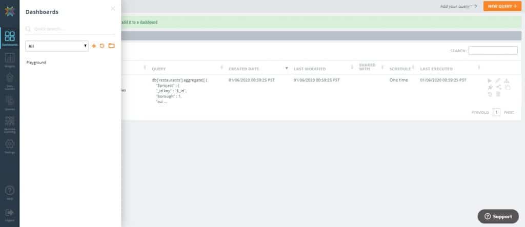
2. Hit the ‘+’ icon to create a new dashboard and give it a name then click ‘OK’
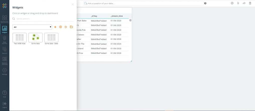
3. Drag the query/report (widget) you previously created into the dashboard. By default, it will be in grid form
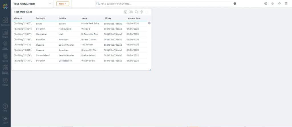
4. On the top-right corner of the widget, click the ‘More Settings’ icon then select ‘Analyze’
5. In the following screen drag borough and cuisine to the ‘Groupings/Dimensions’ section
6. Drag _id key to the ‘Fields/Metrics’ section. In the ‘Operation’ dropdown, select ‘Count’ (Notice that for the Bronx (first row), there are 38 types of bakery )
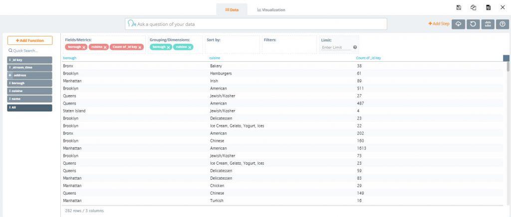
8. At the top of the screen, click the ‘Visualization’ tab which takes you to the visualization settings screen. We want to create a stacked column chart with borough in the x-axis and cuisine count in the y-axis
9. In the ‘Options’ section under the ‘Grouping/Legend’ dropdown, select cuisine. The various cuisines are now differentiated by color for each borough
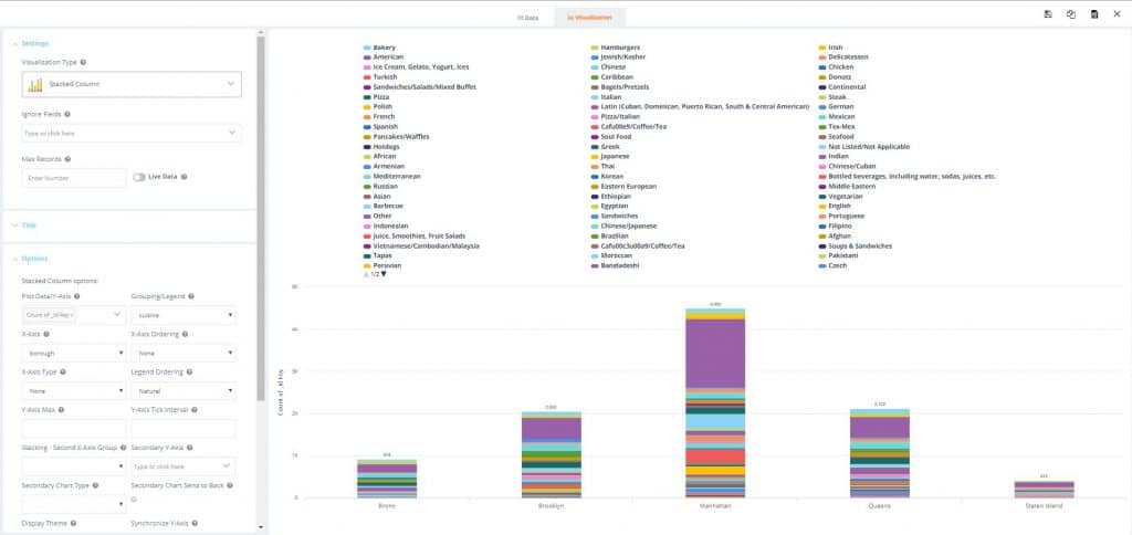
10. Hit the ‘Save’ icon and exit out of the screen to see the new visualization in your dashboard
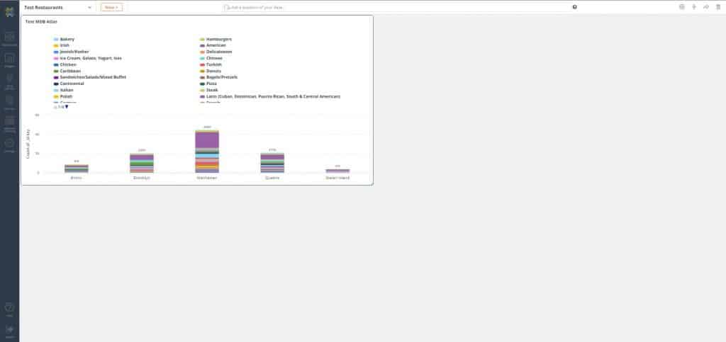
11. Let’s clean up the visualization by adding filters. Start by clicking the ‘Filter’ icon to open the ‘Filters’ pane
12. Click the ‘Add’ icon. In the ‘Fields to filter’ dropdown, select cuisine
13. In the ‘Values’ drop down select the following types of Asian cuisine: Asian, Chinese, Japanese, Vietnamese/Cambodian/Malaysian
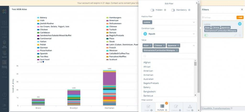
14. Hit ‘Save’. Notice the visualization looks cleaner, displaying the count of cuisine for each borough and the proportion of each type of cuisine in them
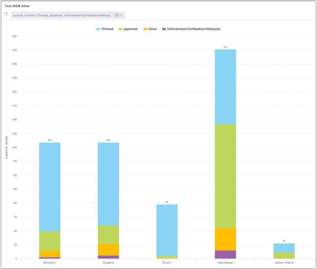
Congratulations! In just a few simple steps, you have created your first visualization from MongoDB Atlas data with Knowi.
Drilldowns
Now, let’s take this a step further and find out where these restaurants are located with a drilldown to produce a cluster map of restaurants for a given borough and cuisine.
Drilldowns enable powerful point and click actions from one widget into another widget. Data from the parent widget can be used as keys into the drilldown widget to filter the data specifically for the point selected.
Steps:
Let’s start by cloning our existing widget and adding it to the dashboard.
- On the top-right corner of the widget, click the ‘More Settings’ icon then select ‘Analyze’
- Click ‘Clone’ icon and name the new widget ‘Location’. While in the Clone Chart, click the ‘Clone’ button and add it to the dashboard. This will create an identical bar chart widget to the one you had previously
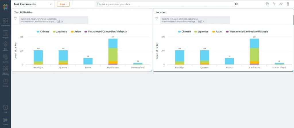
3. In the newly created widget, click ‘Analyze’. Remove the existing fields and groupings
4. In the field list on the left, expand the address field and drag coord (coordinates) to Fields/Metrics. Then drag borough, name, and cuisine as well
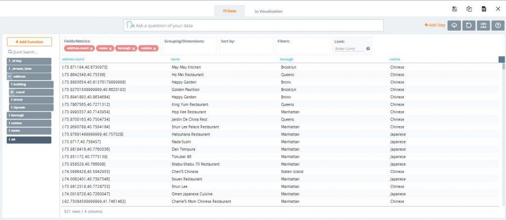
5. At the top of the screen, click the ‘Visualization’ tab which takes you to the visualization settings screen
6. In the ‘Settings’ section under the ‘Visualization Type’ dropdown, select ‘Geo – Clusters’ then save. You can now visualize the location of each restaurant on a map of New York City
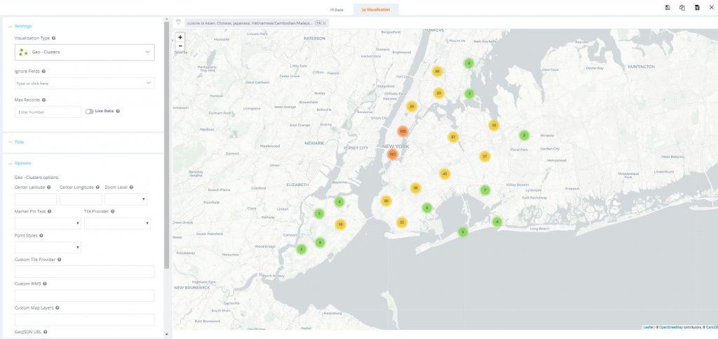
Now, let’s continue by setting up a drilldown from the parent bar chart into the map.
7. On the top-right corner of the bar chart widget, click the ‘More Settings’ icon then select ‘Drilldowns’. The drilldown menu box will appear
8. Under the ‘Drilldown type’ dropdown, select ‘Widget’. For ‘Drill into’, select ‘Location’. For ‘Optional Drilldown Filters’ select ‘borough’ = ‘borough’. Hit ‘Save’
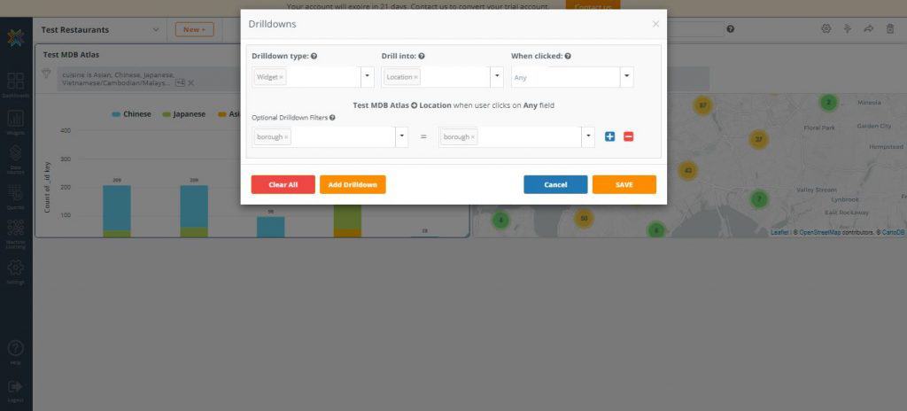
9. Remove the duplicate ‘Location’ widget from the dashboard
10. In the original bar chart widget, click on the ‘Chinese’ cuisine type section of the Manhattan borough bar
11. By clicking on any coordinate on the map, you can drill down further into the specific locations of each Chinese restaurant in Manhattan
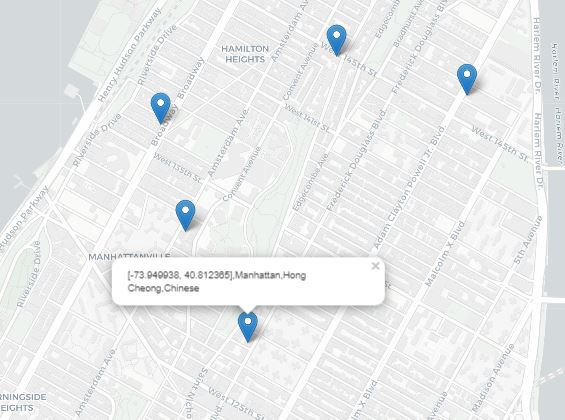
Drilldowns allow you to visually navigate and analyze data in powerful ways and with just a few additional steps, you were able to use it bring an interactive dimension to your MongoDB Atlas data.
Data blending NoSQL and SQL data with Joins
What differentiates Knowi is the simplicity with which you can join data from disparate data sources. With just a few clicks, you can create joins across multiple data sources to process, blend, and store combined results seamlessly. All join types are supported so all you need to know is the fields you wish to join.
In the following steps, we’ll be joining data from MongoDB Atlas and MySQL pertaining to an email sending campaign that can then be used for downstream analytics. We’ll also show you how to use Cloud9QL, Knowi’s SQL-like syntax for optional post-processing.
Connecting Your Datasources
Since we’ve already connected to a MongoDB Atlas datasource in the steps above, we’ll repeat these steps to connect to your second datasource, which is a MySQL database.
Steps:
- From the Knowi UI, select “Datasources” on the left-hand side panel and click ‘New Datasource’ at the top-right corner
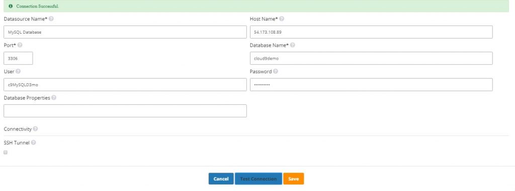
- Select MySQL from the list of datasources. Like before, the connection settings are Pre-configured
- Once in the “New Datasource” page, start by giving your datasource a name. The rest of the fields are pre-filled
- Click ‘Test Connection’ to confirm successful connection to the MySQL database then hit ‘Save’
7. In the ‘Collections’ drop down menu, choose the sendingActivity collection
8. In the ‘Metrics’ drop down select your key field customer, followed by the message_type, sent, and opened fields
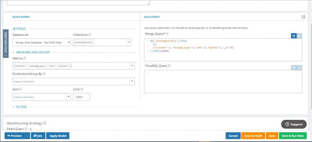
9. If you wish, you can click ‘Preview’ to quickly preview the results
Joining Your Datasources
Now that you’ve connected and queried your first datasource, MongoDB Atlas, let’s join it with a completely different data source from MySQL.
Steps:
- While still in the ‘New Query’ screen, click the ‘Join’ button on the lower-left side of the screen. Select ‘MySQL Database’ from the ‘Datasource’ dropdown
- This will populate the ‘Join Fields’ section and another ‘Query Builder’ and ‘Query Editor’ sections below the first one
- In the ‘Tables’ dropdown menu, choose the customer table
- In the ‘Metrics’ drop down select your key field customer, followed by the street and state fields ( Notice that on the MySQL side, the customer table contains mostly customer information-related fields )
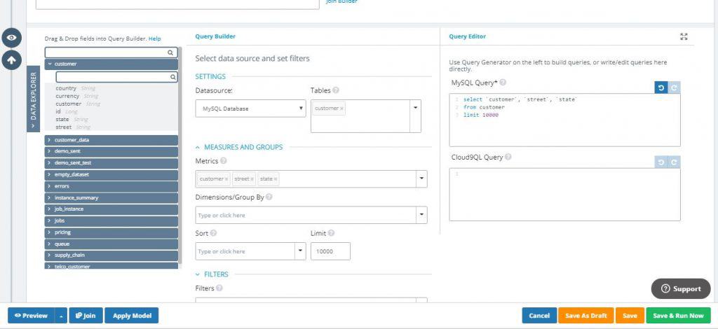
So far, we have our MongoDB Atlas query that gives us the customer, the type of email sent, and how many were sent and opened. In our MySQL query, we get address information from the same customers. Now, it’s time to join these two datasources together.
5. In the ‘Join Fields’ section, click ‘Join Builder’. Note that you can also type in the join free-hand in the text bar
6. Once the fields are retrieved, select ‘INNER JOIN’ as the ‘Join Type. Under ‘Left Field’ (MongoDB Atlas side), select the key field customer. Under ‘Right Field’ (MySQL side), you’ll also select they key field customer then save
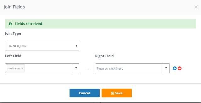
7. Now, let’s click ‘Preview’ to see how our blended dataset looks like

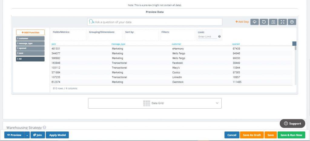
In the new combined dataset, we have the sent, message_type, and opened fields from MongoDB Atlas and the street and state fields from MySQL joined on the key field customer. As you can see, we were able to blend the two datasources without having to duplicate the source data. All we’ve done is individually run the queries from each side of the join then combine them to get the results with just a few clicks. Pretty awesome right?
Post-Processing With Cloud9QL
Cloud9QL is an optional SQL-like syntax to transform data in powerful ways when needed. Not only does it allow you to clean, transform, and post-process data, but also generate alternate views from the same data within Knowi as well as query file-based data or datastores with no/limited query support.
For now, we’ll do a brief demonstration of how you can use Cloud9QL to change the date format in the sendingActivity collection query from MongoDB Atlas in the previous section.
Steps:
- In the MongoDB Atlas ‘Query Builder’ section, add the date field to the list of metrics. Notice that the native Mongo query is generating on the right side
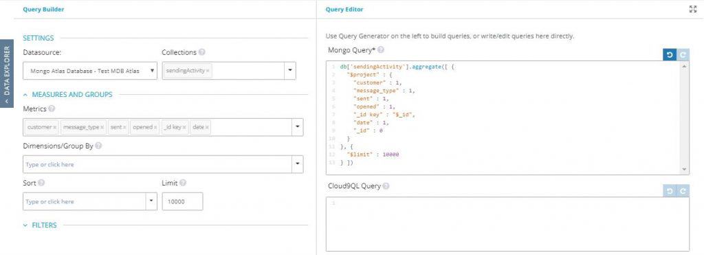
2. When you click ‘Preview’, you’ll see that the date field has been added to the results

3. Back in the MongoDB Atlas query section under ‘Query Editor’, you will see a text box under ‘Cloud9QL Query’. This is where you can use Knowi’s SQL-like syntax to further process the data generated from the query builder
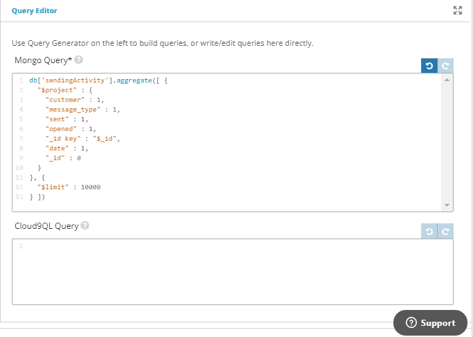
4. For this example, we’ll use the date_format Cloud9QL function to extract the day value from the original date field using the syntax:

5. When you click ‘Preview’, you’ll see that a new field called day has been added to the results showing only the day value extracted from the original date field

And there you have it! In just a few short steps, we were able to post-process MongoDB Atlas data with Cloud9QL.
Advanced Features
In the sections above, we demonstrated how easy it is to connect with MongoDB Atlas to create your first visualization. Then, in just a few short steps, we were able to connect and blend data from MongoDB Atlas and MySQL using Knowi’s Join capabilities.
Now, we’ll go over Knowi’s more advanced Natural Language Processing (NLP) and Integrated Machine Learning features that you can leverage for more advanced analytics.
Natural Language Processing & Self-Service Analytics with Knowi
Knowi’s NLP is a Google-search-like capability that allows you to type in questions in plain English from the underlying data and get answers instantly. This gives even non-technical users the ability to gain insights from the data without having to understand the underlying structure and syntax from the source data. In the following steps, we’ll use a brief example of using NLP to ask questions from the blended email sending activity dataset we created in the previous section.
Steps:
- On the left-hand side panel, select ‘Queries’
- Look for the Email Sending Activity query we created in the previous section, and click the ‘Edit’ icon
- Click ‘Preview’ to view the query results
Now let’s ask the data questions by typing them in the NLP text bar. Let’s find out the maximum emails that were sent, the number of emails sent for each customer, and the average emails opened by messsage_type.
4. In the NLP text bar, type: “maximum emails sent” (Notice that as you type, Knowi auto-suggest the question you are asking. Once finished, you’ll see that the maximum emails sent was 1,241,066)

5. Now, let’s see how many emails were sent for each customer by typing: “emails sent by customer”

6. Finally, let’s see the average number of emails opened by message_type by typing: “average opened by message type”

As you can see, by simply typing in questions in the NLP text bar, we were able to quickly gain insights from our Email Sending Activity dataset.
Integrated Machine Learning
Knowi comes with built-in machine learning algorithms supporting classification, regression and anomaly detection use cases. You can train your models in Knowi and use Cloud9QL to remove outliers so you don’t need separate data prep tools.
In the terminology of machine learning, classification is considered an instance of supervised learning where a training set of correctly identified observations is available. An algorithm that implements classification, especially in a concrete implementation, is known as a classifier.
In the example below, we’ll perform classification machine learning using credit card payment history data to predict whether a client will default on their next payment period based on their prior payment behavior.
Create a Workspace
First, we’ll create a workspace, which can be thought of as a folder that will contain all your subsequent machine learning models for the particular use case in question. Then, we’ll download and use a sample credit card dataset that contains 30,000 client Credit Card data with 24 attributes including:
- Personal characteristics such as age, education, gender, and marital status
- Credit line limit information
- Billing/payment history for the 6 months period from April to September of 2005
You can download the dataset here
Steps:
- On the left-hand side panel, select ‘Machine Learning’
- On the top-right corner, click the ‘New Workspace’ button then select ‘Classification’. Gave your workspace a name and hit ‘Create’
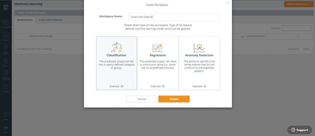
3. In the next screen under Step 1, click ‘upload new dataset’
4. Choose the ‘default_credit_card_clients’ dataset your previously downloaded then click ‘Upload’

5. In Step 3, select default as the attribute to predict in the dropdown ( Note that we will be skipping Step 2 since we will not be using Cloud9QL for further data manipulation in this example)
6. In Step 4, click the ‘Analyze Data’ button. This will populate a preview of the data set in grid form
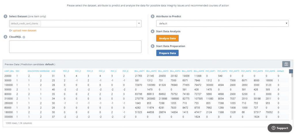
7. In Step 5, click ‘Prepare Data’
Data Preparation Wizard
Data preparation is an optional, wizard-driven process that involves going through a step-by-step process where the program confirms the training set data types, identifies and allows for the removal of outliers, reports missing data with the option to remove or impute values, allows for rescaling of the data, groups into discrete bins, and provides the option to create dummy variables. All decisions can be changed by moving backwards and forwards through the steps at any time.
Steps:
- Confirm all model attributes are of the correct data type
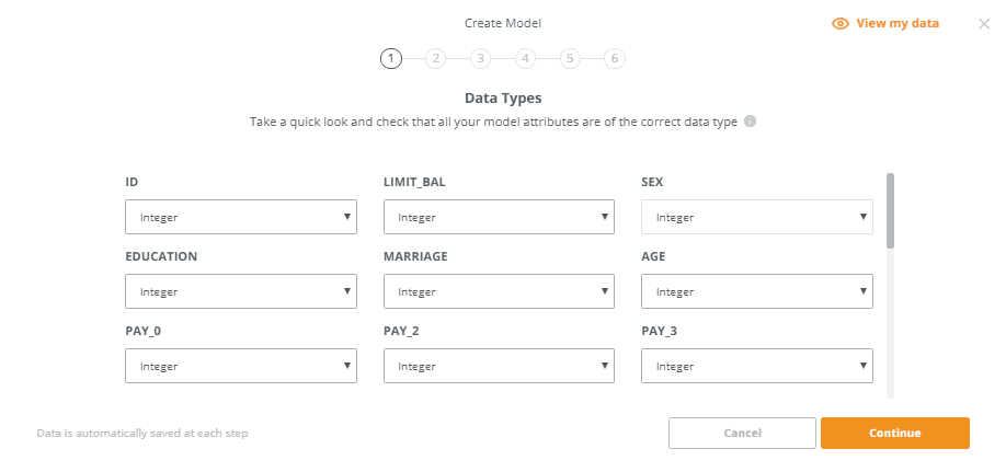
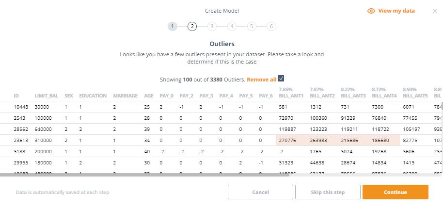
2. This step alerts us if there are outliers in our data. It appears that our dataset has over 3,000 outliers. Let’s check the ‘Remove all’ box to remove them from our dataset
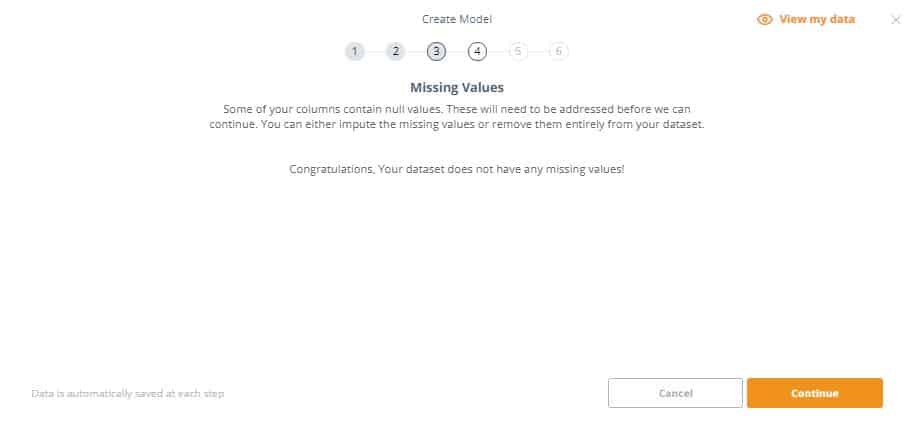
3. This step identifies if our dataset has missing/null values. If this is the case, you’ll have to either impute the missing values or remove them entirely from the dataset. In this example, there are no missing values so we can proceed
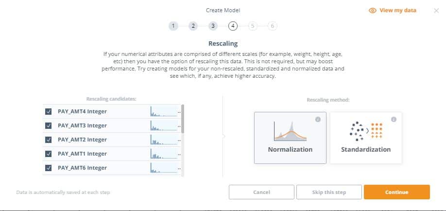
4. This step gives you the option to do rescaling on your data. This is useful since the numerical attributes are comprised of different scales and rescaling can help boost the model’s performance. Let’s select all fields in the dataset to be rescaled, and select ‘Normalization’ as our rescaling method.
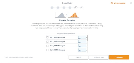
5. Discrete Grouping involves taking numerical data and converting it into logical, ordered groups or bins of data (ordinal attributes) and useful if there are natural groupings within your column data. We’ll skip this step for our example.
6. Some algorithms only work with numerical data and do not support nominal or ordinal data. It will therefore be necessary to convert these values into real values. Each category will be transformed into a column (or attribute) and 0 or 1 will be inserted as the value. Our data doesn’t have any dummy variable candidates so we can continue
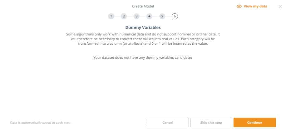
Great! We have just completed the data preparation wizard and can move on to Feature Selection.
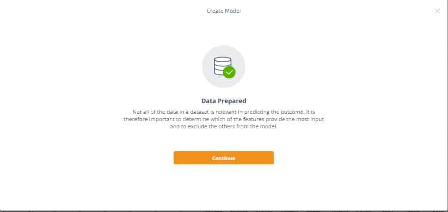
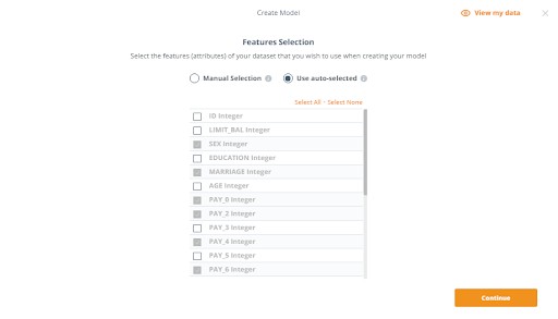
Feature Selection
Feature selection is the process of choosing the variables (attributes) of your dataset that you wish to use in creating your model. To make this decision it is essential to check back at the data, looking for patterns and correlations if you are choosing the features manually. You also have the option to have Knowi auto-select the features by performing correlation calculations against your dataset, which we’ll be doing in this example.
Create and Compare the Models
In this section, you have the option to choose between the available algorithms (i.e. Decision Tree, Logistic Regression, K-Nearest Neighbor, or Naive Bayes). Knowi makes it easy to choose all available and compare them with useful attributes such as accuracy or the absolute deviation.
Steps:
- Check all of the available models so we can compare the results for each one
- Click the ‘Train’ button to start training your models

Once training is complete, the results will be produced on the right hand side. Pressing the little eye next to the model created in the results section will show a preview of the input data along with the predictions of the program. Next to the eye there is a plus sign that, when pressed, will display the details of that specific model.
It is beneficial to produce many models and tweak settings each time to find the best one for the situation. All past models are saved in history and can be viewed, compared, and even published.
According to the results, the Decision Tree model produced the highest accuracy.

Publishing the Model
You can publish as many models as needed from the same data. All models that are created can be viewed and compared directly in the ‘Published Models’ tab within Machine Learning. In this example, we’ll publish just the Decision Tree model since it produced the highest Accuracy score.
Steps:
- In the Decision Tree result, click the ‘Publish Model’ icon to the right of the plus sign
- Upon publishing, a prompt to name the model will be displayed. Name your model then click ‘Publish’

3. You can now view your newly published Model directly in the ‘Published Models’ tab of the Machine Learning screen

Apply the Model to a Query
Now you have officially created a machine learning model, you can seamlessly apply it to any query. Below, we’ll go through the steps of applying the model we created to the default_credit_card_clients query we created earlier.
Steps:
- On the left-hand side panel, select ‘Queries’ and edit the default_credit_card_clients query

2. Click the ‘Apply Model’ button on the lower left-hand side of the ‘Edit Query’ screen
3. In the ‘Model’ dropdown, select the machine learning model you just created

4. Press the ‘Preview’ button to show the dataset with the results of the query along with the predictions made by the model. Notice the Predicted Value field all the way to the right of the data grid
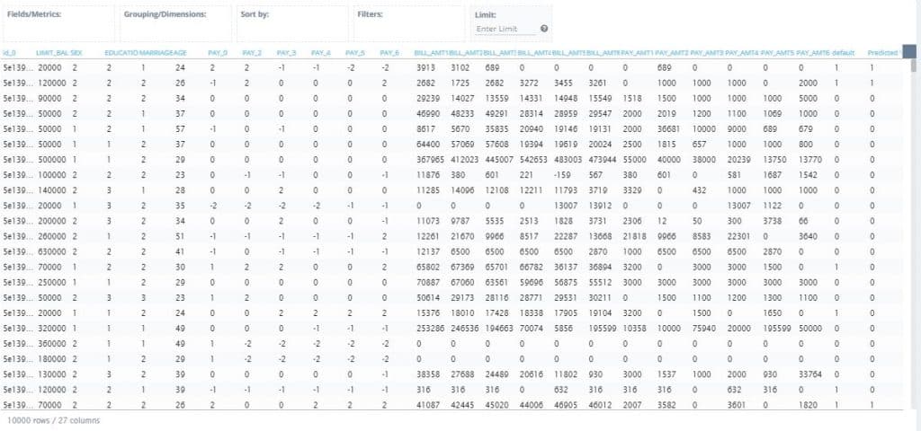
And that’s it! Having gone through these steps, you have built a machine learning model that can be integrated into any workflow and create new visualizations and insights that will drive downstream actions. The applications of the machine learning model are endless and can be tailored to individual use cases.
Once a model has been created, you can also set up trigger notifications that will alert you in the case that a certain condition is met. In the scope of the credit card dataset for example, an alert can be set to email credit collection agencies in the situation that a client has defaulted on their payments. This enables more than just insights, it generates action.
Summary
To summarize, we used Knowi to connect to data in MongoDB Atlas and build visualizations from it in minutes, demonstrate how you can blend data on the fly from SQL and NoSQL data sources, and explore its advanced features like NLP and and Integrated Machine Learning.